Crealab
Branding with Silhouette
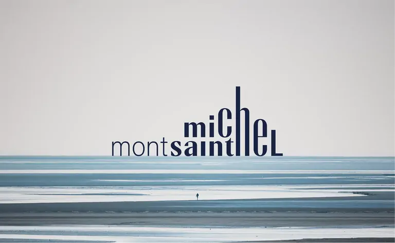
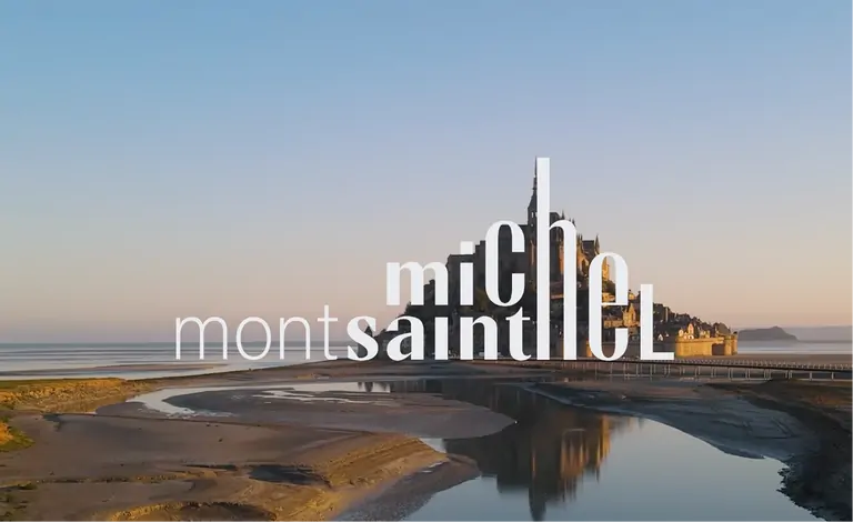
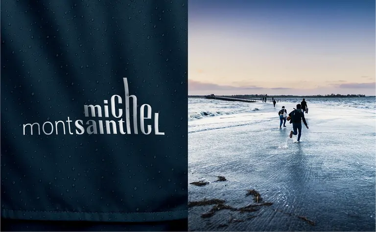
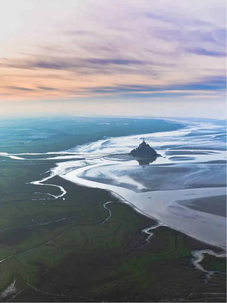
Mont-Saint-Michel, on the Normandy coast of France, a UNESCO World Heritage Site, has unveiled its new visual identity at the start of 2026, designed by Graphéine. And honestly: it’s a bold move, and a very successful one.
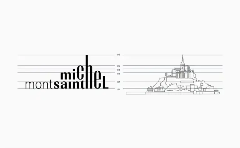
The goal of this rebranding seems to be clear: move beyond the familiar “postcard” image and build a true institutional brand. That’s no easy task for a site as iconic as Mont-Saint-Michel, and Graphéine handled it with real intelligence. Instead of drawing the Mont itself, the agency chose to suggest it through the rhythm, balance, and verticality of the letterforms. A smart shift toward abstraction and typography rather than literal representation. It’s an example of successfull branding design.
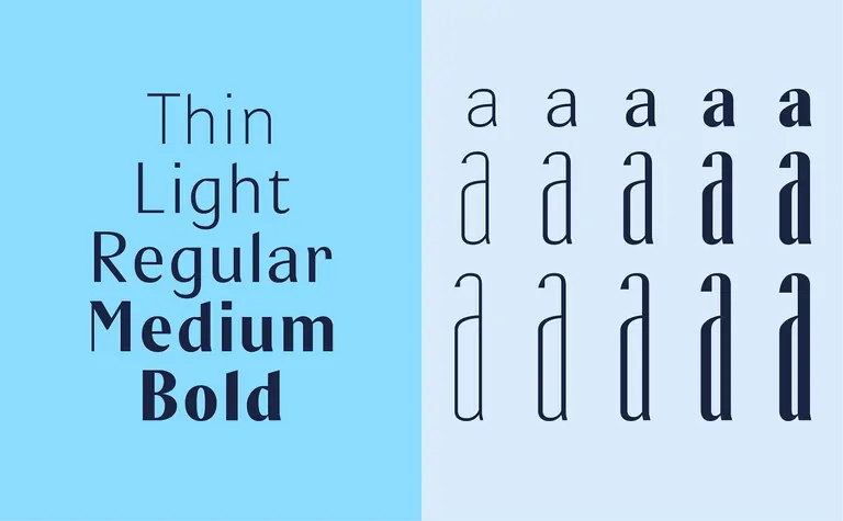
The unique typeface, developed specifically for this identity in collaboration with Blaze Type, gives the project its strength and character. Inspired by medieval script, It feels both rooted in history and contemporary.
In the end, this project is a great reminder that whether you’re working on a world-famous site or a small local business, the process is the same: dig deep to find the true essence of the brand, and translate it into a visual language that can last.
Bravo!
January 2026
+46 733 50 33 90
hello@lescreatives.com
Östgötagatan 12
116 25 Stockholm
Sweden
© 2025 Les Creatives Stockholm AB
CRN: 556905-9792